Creating great slides for your presentation doesn’t have to be complicated. What you want is a presentation that engages, informs, and impresses your audience. It all starts with your slides. Your title slide is literally the first thing the audience sees before you even begin to speak. A well-crafted slide supports what you’re saying and makes your message clearer.
You can start with a template
If you struggle to create your slides from scratch, we recommend using templates from Slidesgo. They offer a variety of free templates that can make your presentation look polished and professional without much effort. Just type in a keyword or topic, and you’ll find templates tailored to your needs. This saves you time and ensures your slides are visually appealing.
All images used in this blog are screenshots from actual presentation slides made and submitted by previous NCUK students, who got exceptional grades.
Use Bullet Points Wisely
Break down complex ideas into short bullet points or phrases while retaining the full information being conveyed. This helps in delivering information step-by-step.
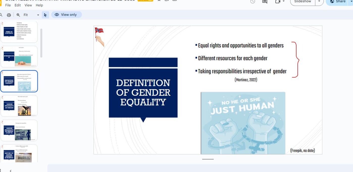
- Do: Use bullet points for lists and key points
- Don’t: Write full sentences or paragraphs
Why It Matters: Bullet points make your content easier to digest. Full sentences? Not so much. Save the details for your spoken words. Slides should not replace your speaking and aren’t meant to be read like a book.
Keep it Simple
Sometimes, less is more.
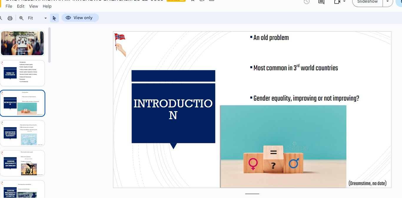
- Do: Use slides to highlight key points which need to be expatiated
- Don’t: Cram slides with too much text or too many images. You want people to listen to you, not get lost in your slides.
Why It Matters: Simple slides help keep your audience focused on your message. If there’s too much going on, they’ll get distracted. This is why it’s recommended to avoid using animations for school presentations because they can distract students who already have short attention spans. However, if you must use them, do so sparingly.
NO LONG PARAGRAHS
Yes, this has already been mentioned in ‘Use bullet points wisely’, but it needs to be emphasized. Examiners pay attention to this when they review your slides and presentations. So, it’s an important point to take note of and make a conscious effort to avoid.
- Do: Use short sentences and phrases
- Don’t: Write long paragraphs.
Why It Matters: You can look at it two ways. Either the long paragraphs prevent people from listening because they are too busy trying to read what’s on the slides, or the long paragraphs may be too hard to read that they cause people to tune out. You also don’t want to be tempted to read directly off your slides because it will make your presentation sound robotic and unnatural.
Add a Table of Contents (or Equivalent)
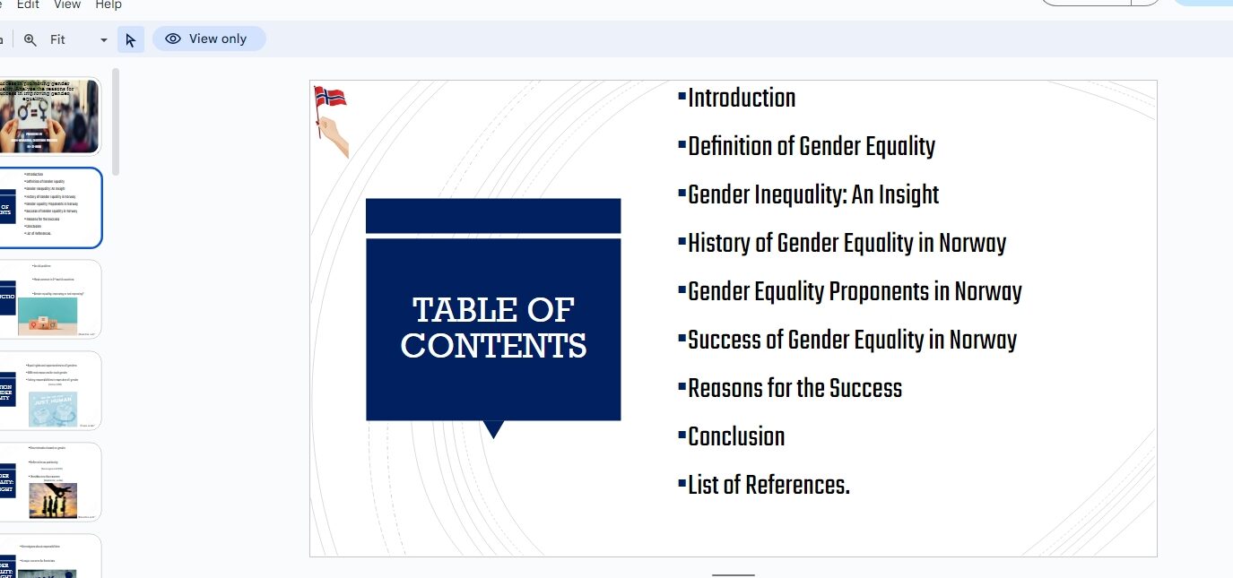
Including a table of contents or an agenda slide at the beginning helps your audience know what to expect. It’s like giving them a roadmap of your presentation.
- Do: List the main sections or topics you’ll cover.
- Don’t: Skip this step, especially if your presentation is long or complex. The audience may feel lost without it.
Why It Matters: A clear agenda keeps your audience on track and makes your presentation easier to follow.
Use Images and Graphics Wisely
Images, charts, and graphics can make your presentation more engaging, but only if they are high quality and relevant to your content.
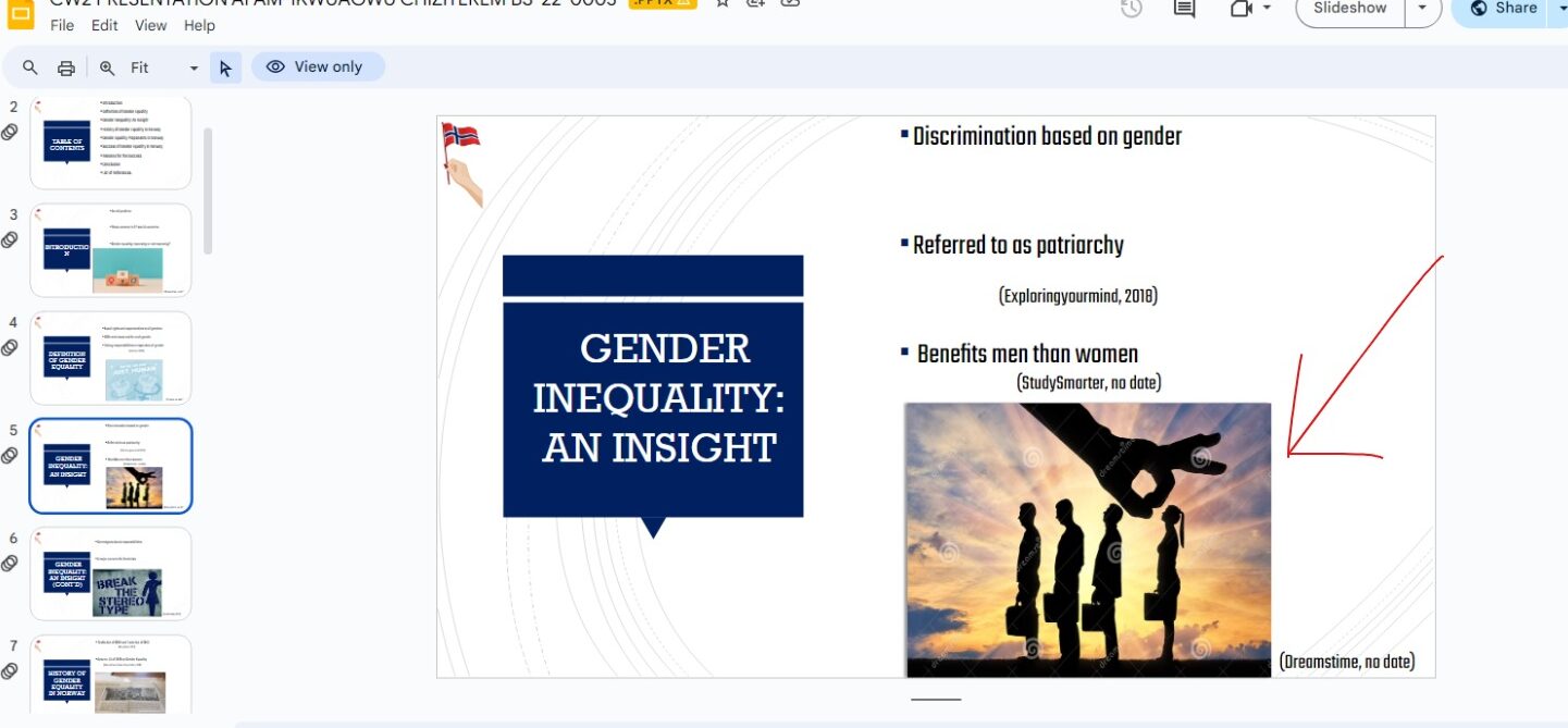
- Do: Include images that illustrate your points or make your slides more interesting.
- Don’t: Overload your slides with too many images or use low-quality visuals.
Why It Matters: Relevant images can enhance understanding and retention but overusing them can make your slides cluttered and distracting.
Choose Easy-to-Read Fonts and Colors
Your slides should be easy to read from a distance. Choose simple fonts like Arial or any other and use contrasting colors for text and background (e.g., dark text on a light background).
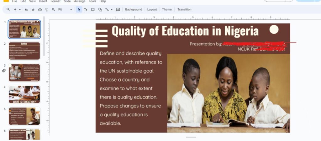
- Do: Use large, clear fonts and high-contrast colors. Ensure your text size is big enough to be seen from the back of the room.
- Don’t: Use fancy/decorative fonts that are hard to read, or colors that clash/blend into the background. Also text that’s too small.
Why It Matters: Easy-to-read fonts and colors ensure everyone in the room can read the slide without straining their eyes.
Keep your Design Consistent
Consistency in design helps make your presentation look professional. Stick to the same fonts, colors, and layouts throughout your slides.
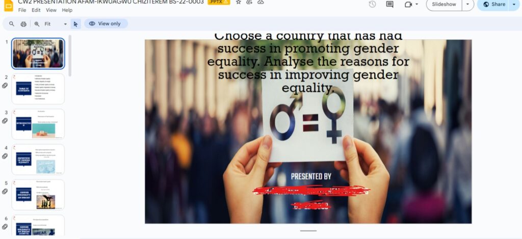
- Do: Use the same design elements and layout across all slides.
- Don’t: Change styles from slide to slide.
Why It Matters: Consistent design helps your presentation flow smoothly and looks more polished.
Limit the Number of Slides
More slides don’t necessarily mean a better presentation. Focus on the quality of your slides, not the quantity.
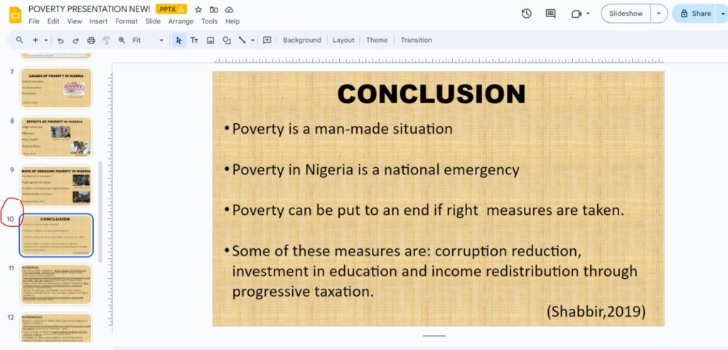
- Do: Include only the most important slides that help convey your message.
- Don’t: Overwhelm your audience with too many slides or too much information on each slide.
Why It Matters: Too many slides can make your presentation feel long and drawn out. A few well-chosen slides can help keep your audience engaged and interested.
Citations and References
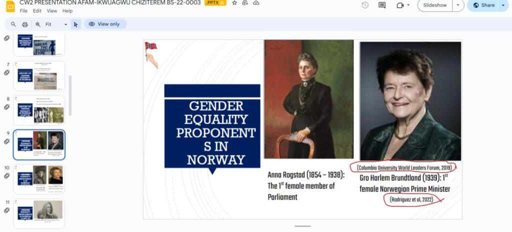
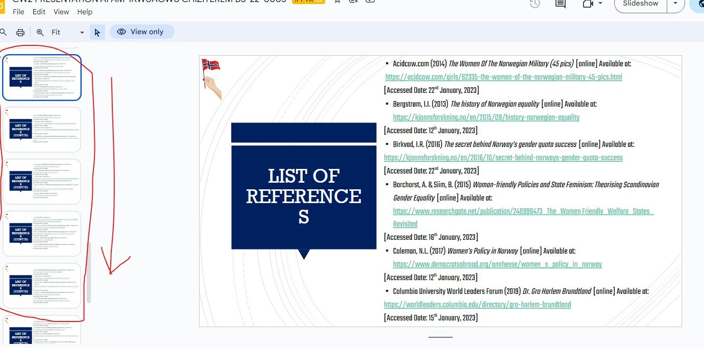
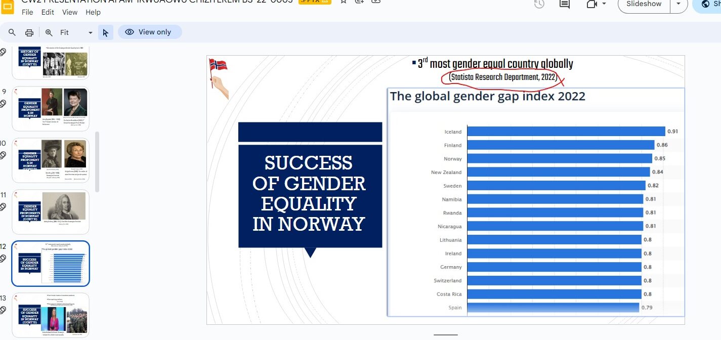
Always give credit where it’s due. If you use someone else’s ideas, images, charts, or data, cite them on your slides. At the end of your presentation, include a slide (or slides) dedicated to references.
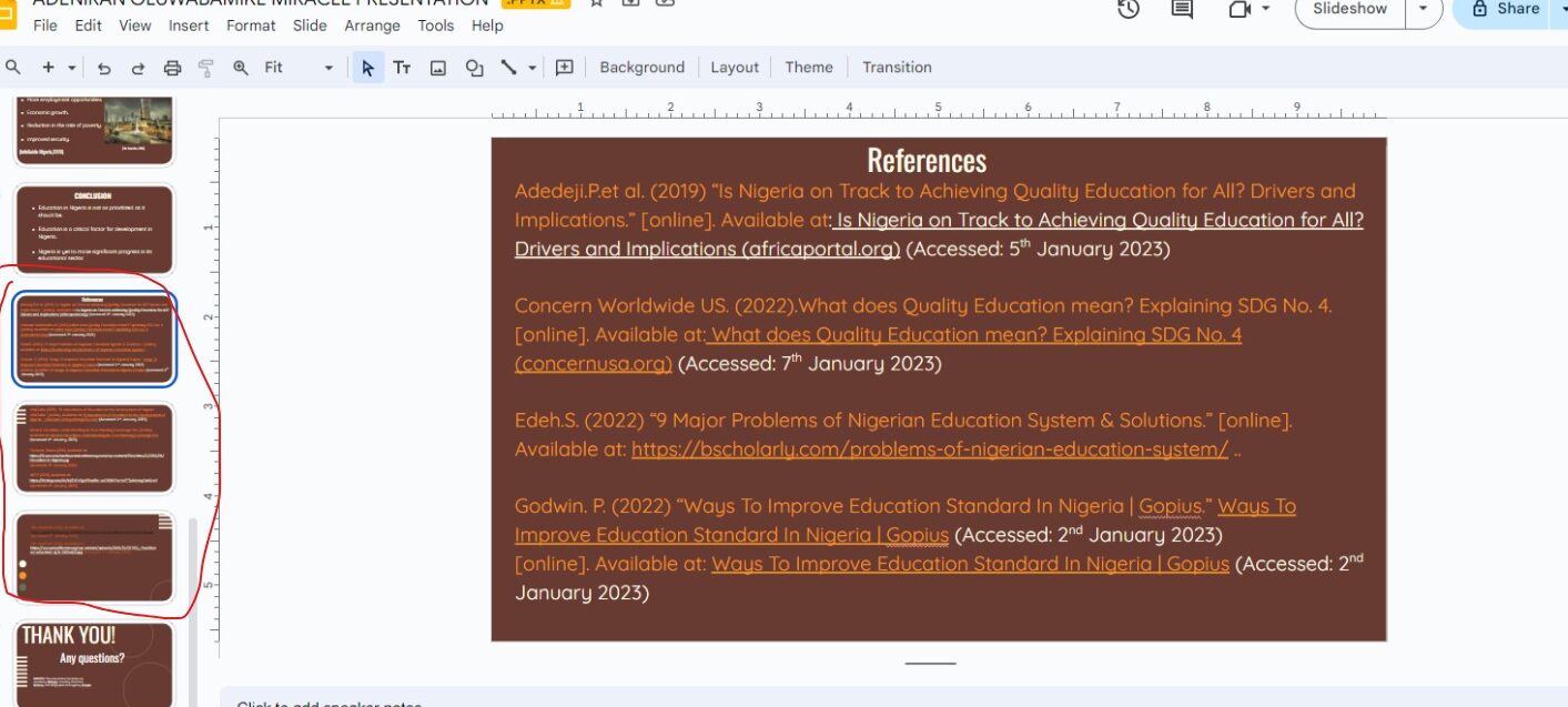
Why It Matters: Citing your sources shows you’ve done your homework and respects the original creators. Not citing means you have stolen someone else’ work whether intentionally or not (PLAGIARISM). This will lead to immediate disregard and failure of your hard work. It also allows your audience to find the sources if they want more information.
How to Cite Properly:
- In-Text Citations: Mention the source right on the slide where the information or image appears.
- Reference Slides: At the end of your presentation, list all sources in a separate slide or slides.
Do:
- Cite everything that’s not your own original thought.
- Use a consistent format for citations (e.g., APA, MLA).
- Include at least 3–5 different citations to show a range of research.
Don’t:
- Forget to cite any borrowed content. Even images, charts, or data need citations.
- Use vague references like “Google” or “Wikipedia”—be specific.
Final Thoughts
Slides are a powerful tool to enhance your presentation when used correctly. Keep them simple, clear, and properly cited. This will help you deliver your message effectively and professionally. Remember to end with a slide dedicated to references to give credit where it’s due —this shows you’ve done your research and respect the work of others and to provide additional resources for your audience. Good luck!
Your thoughts matter!
We hope you found our blog helpful and informative. Now, we’d love to hear from you! Your feedback is invaluable in helping us improve and create content that resonates with you. Please take a minute to share your thoughts:
- Was the blog helpful? Did you learn something new?
- How would you describe the writing style? Engaging, clear, or something else?
- What topics would you like us to explore next?
- Any suggestions or ideas for improvement?
Your input will help us refine our content and better serve you. Thank you for being part of our community!




Leave a Reply